Ad Campaign: Eat Plant-Based
PROJECT BRIEF:
Design 3 different posters raising awareness for a non-profit organization. These are Public Service Announcements that are partnering with the Ad Council. The website, ad council logo, and a message are required.
THE PROCESS:
First, I spent time thinking about an organization that needs more awareness and a movement I am passionate about. I narrowed it down to these three options:
1)Eat Plant Based for your Health
2)Eat Plant Based for the Animals
3)Eat Plant Based for the Environment
After a discussion with my peers and Professor, we narrowed it down to the final topic: Eat Plant Based for your Health.
Second step began, researching.
The best organization I found is plantbasedresearch.org. This organization is filled with credible articles explaining the benefits of eating plant-based.
TARGET AUDIENCE:
I lived in London. While living there, I was amazed by the food culture in that city and country. Most everyone is very concerned about health, but eats a lot of red meat. The campaign I created needed to be geared towards people similar to the people I met in the UK. These people are interested in health and wellness, but might not understand the importance of eating plants before meat. I imagined each of my posters in the underground or in a big city. These are where the target audience would be passing.
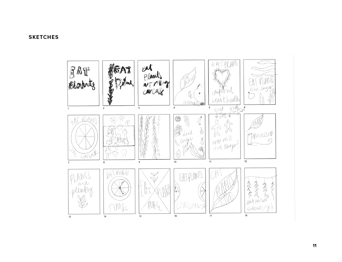
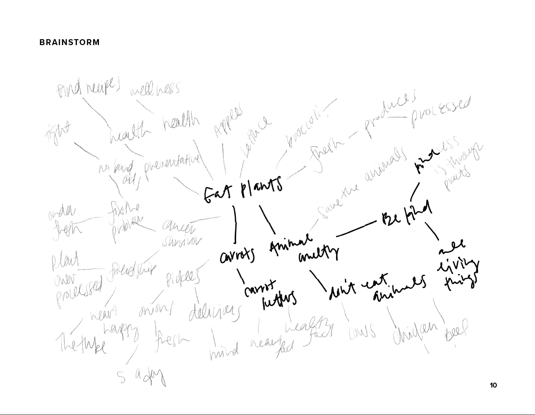
BRAINSTORMING:
After establishing the target audience, I began sketching and brainstorming, then gathering visual assets.
VISUAL RESEARCH:


VISUAL EXPERIMENTATION:
The next step is to begin creating and gathering assets.


DIGITAL DRAFTS:
Below is many attempts to get the posters to their presenting state. Many iterations were needed to get to the final images.
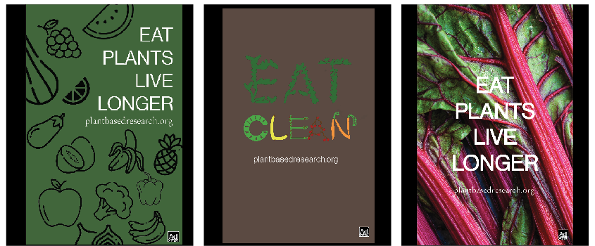
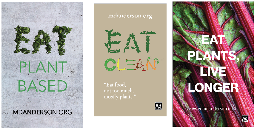
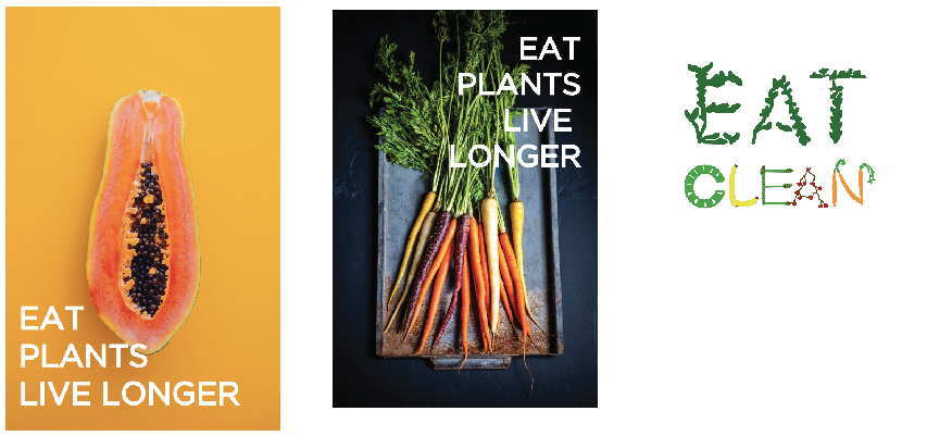

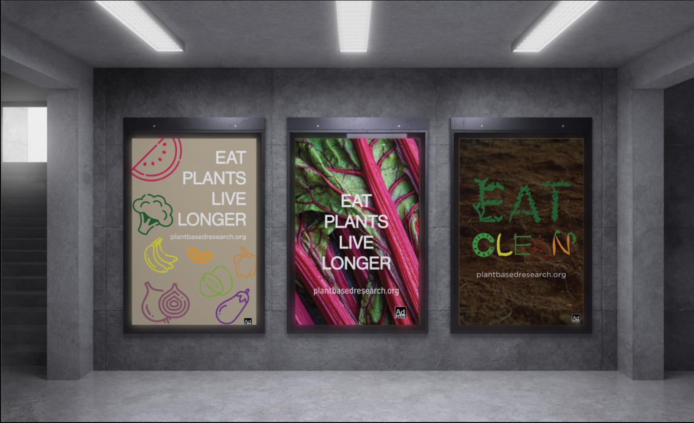
CAMPAIGN POSTER #1:
This poster was created with the intent to remind people that there are many varieties of fruits and vegetables and these little decisions of what we eat make a difference: they give us more time to live!
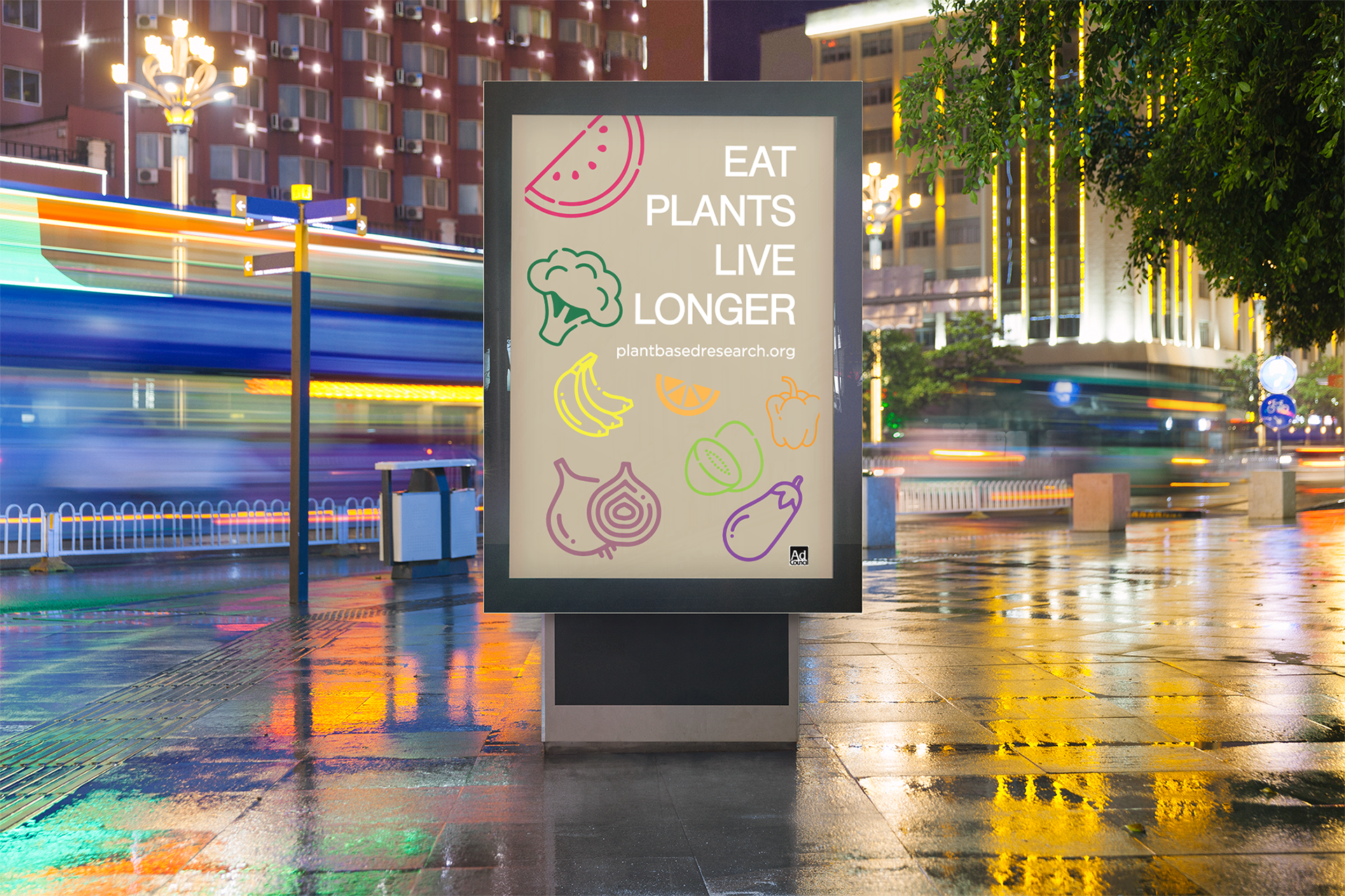

FONTS USED:
Header: Neue Haas Grotesk Display Pro Roman 55
Website: Gotham Book
COLOR PALETTE:

CAMPAIGN POSTER #2:
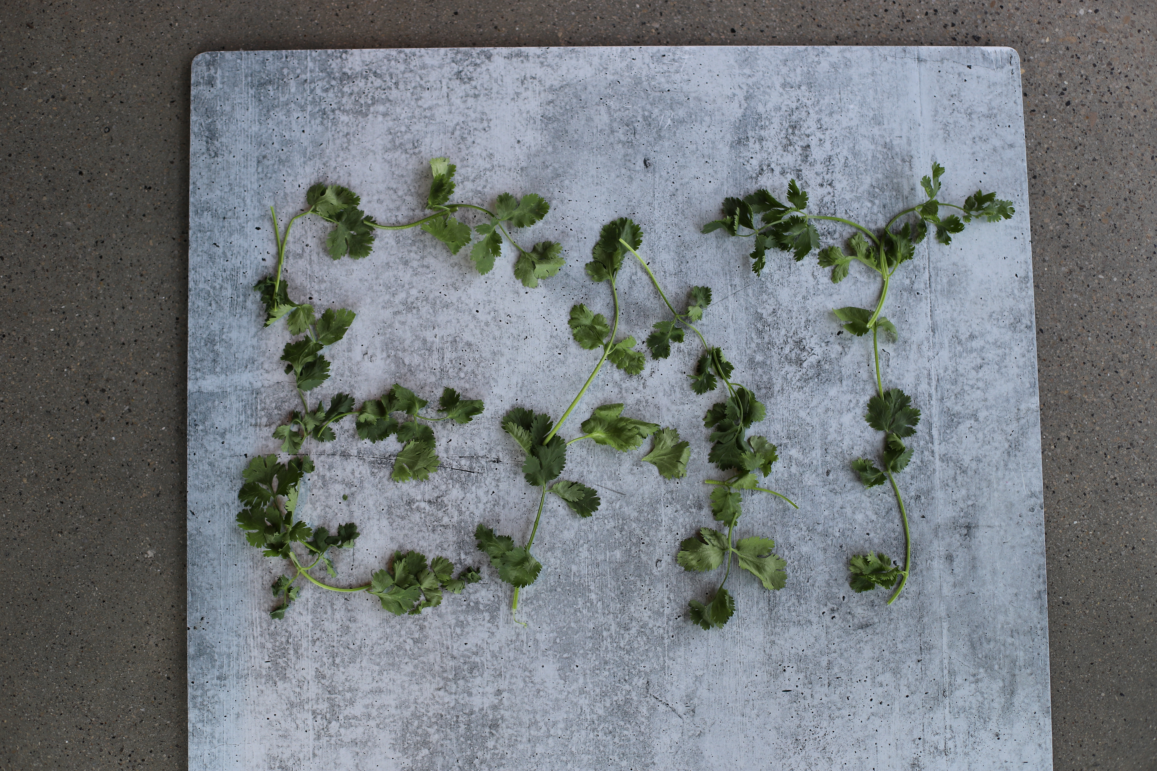
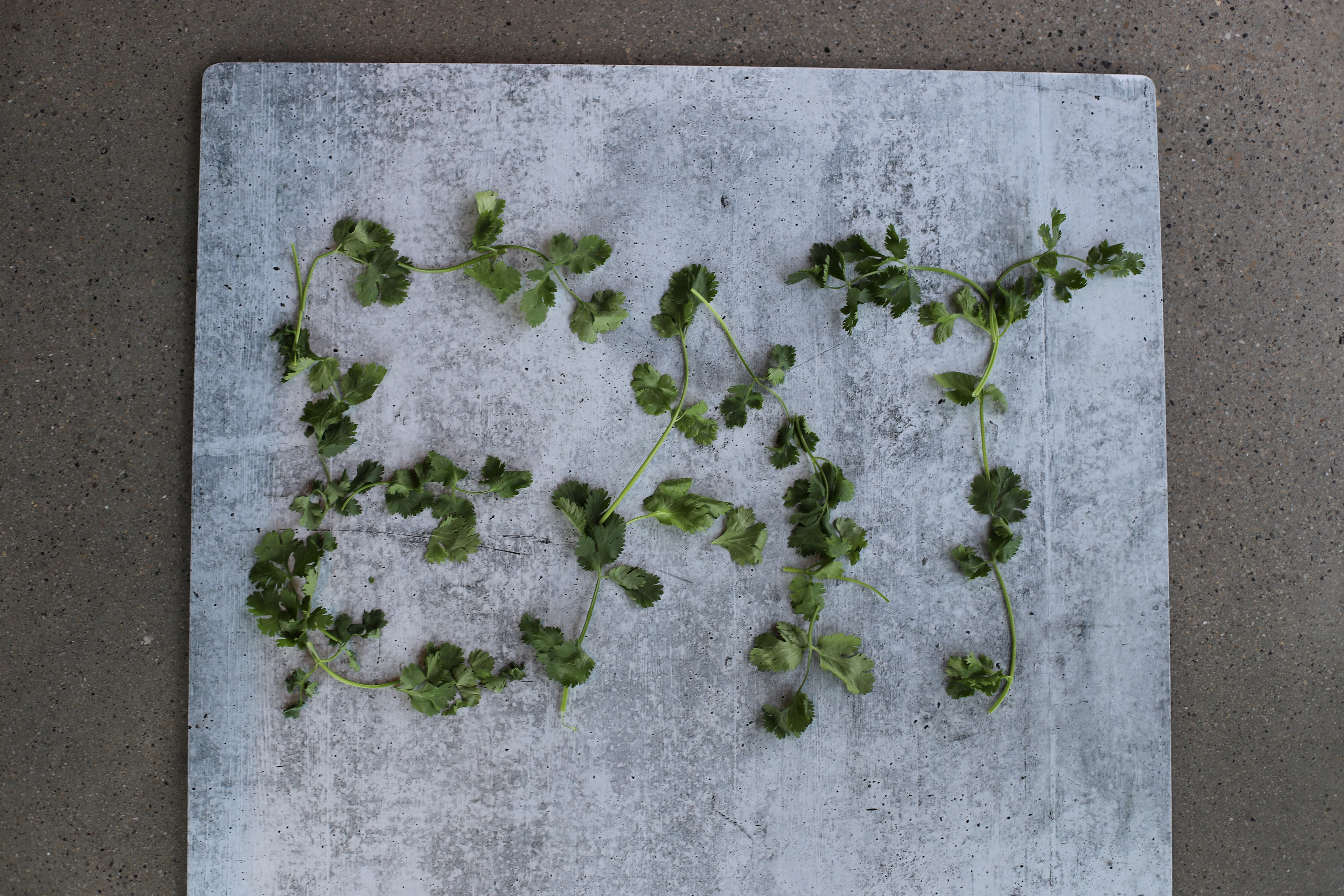
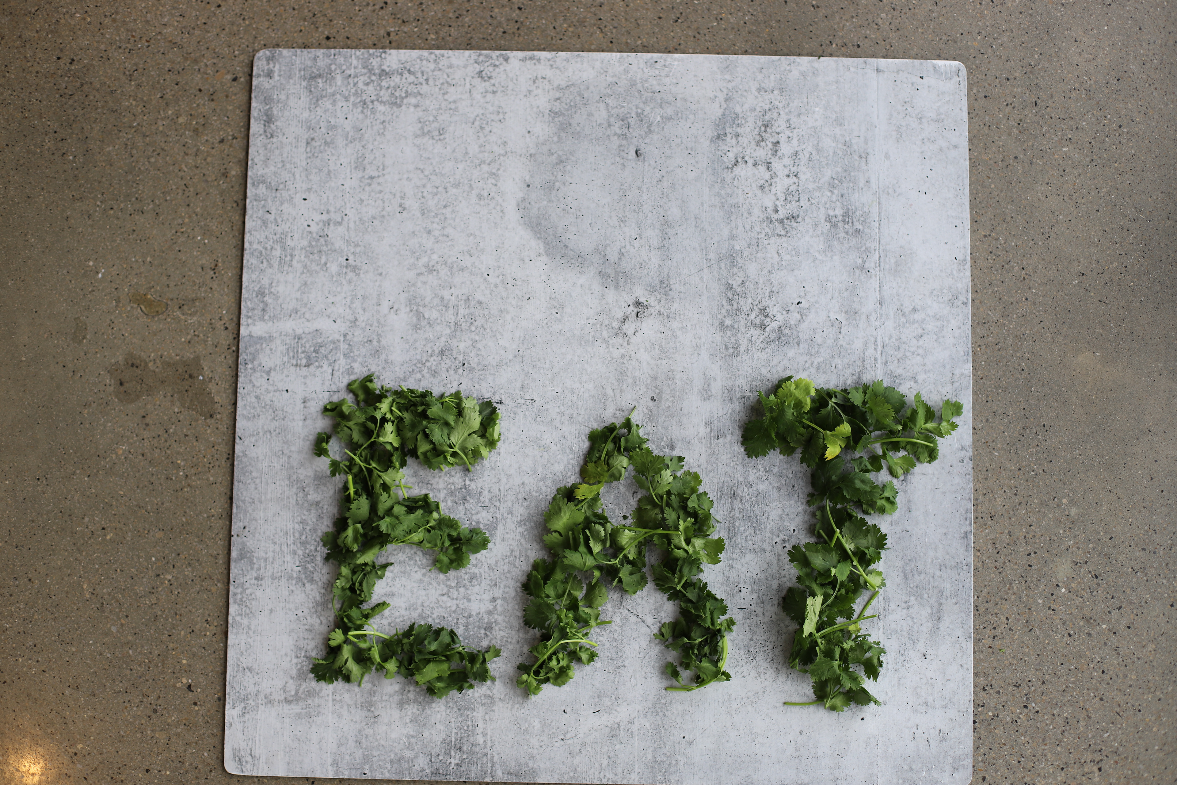
This is an earthy-toned palette with the letters of this simple statement: "EAT CLEAN" made out of vegetables. Everyone wants to eat clean and unprocessed food. This is a reminder that plants are clean, fresh and should be the biggest part of everyone's diet. The goal is to subliminally teach people to eat plants and hopefully spike their curiosity to take a look at the website and learn more.
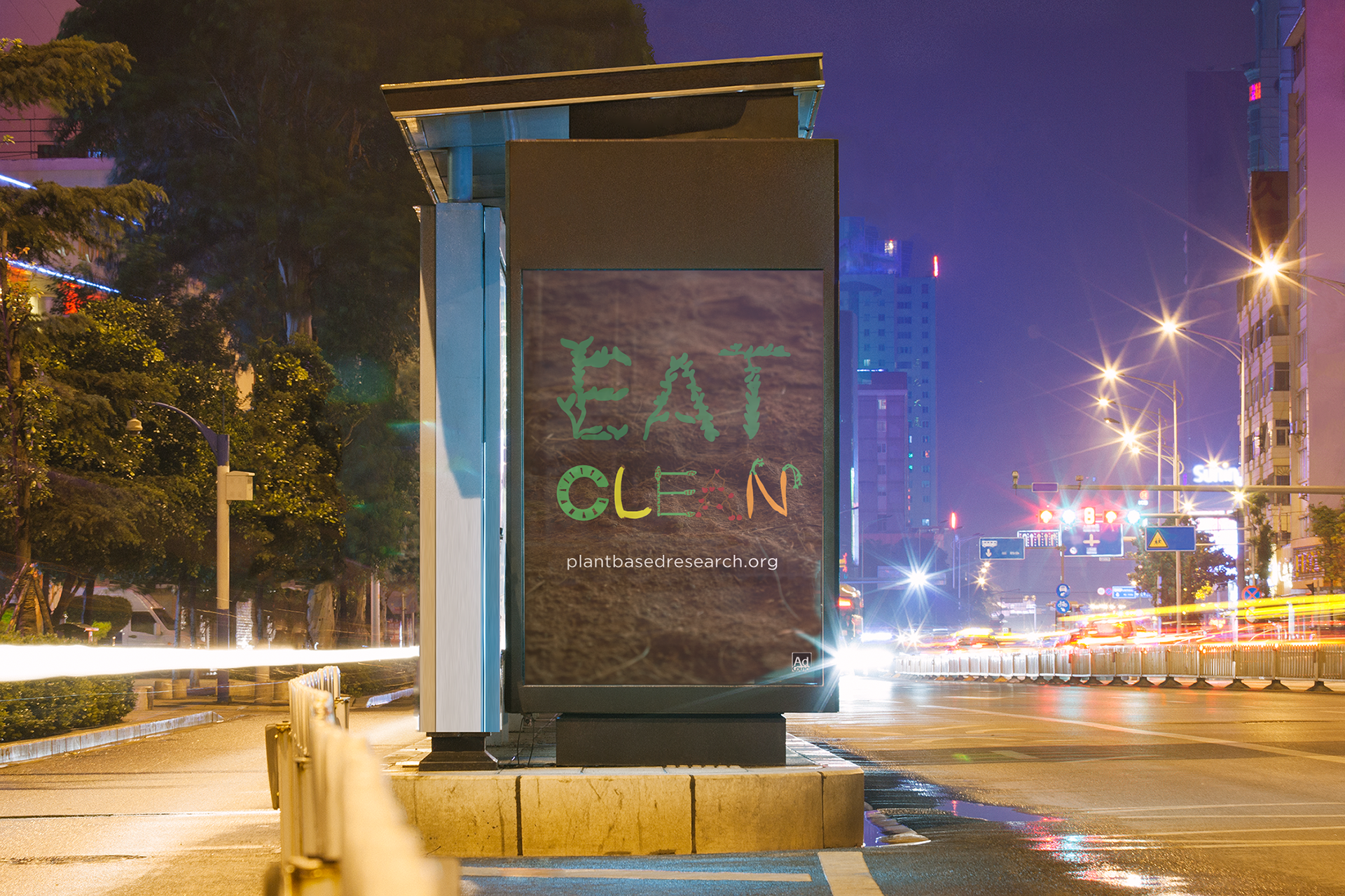
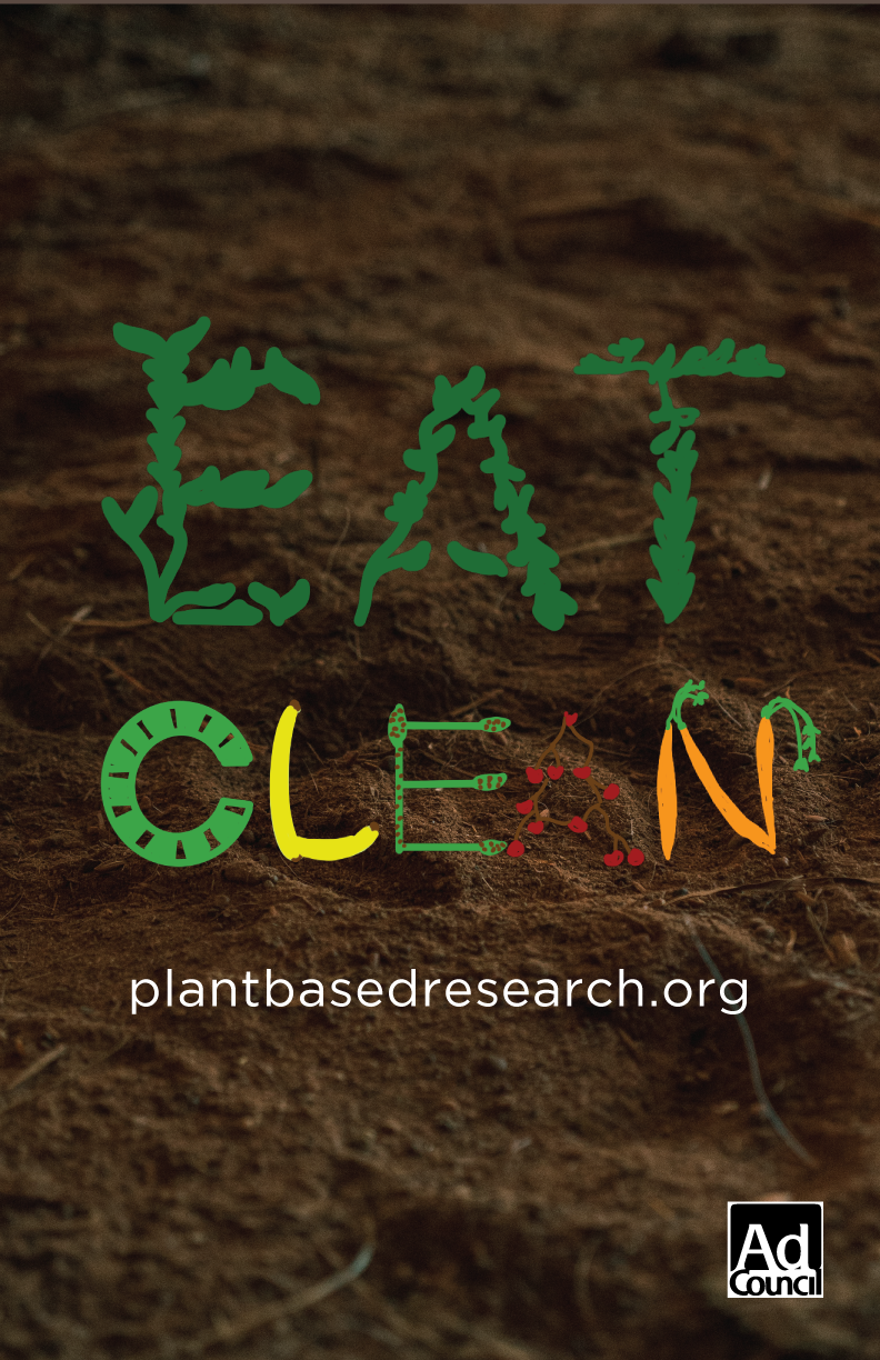
FONTS USED:
Header: Drawn by Me (Zoe O'Grady)
Website font: Gotham Book
COLOR PALETTE:

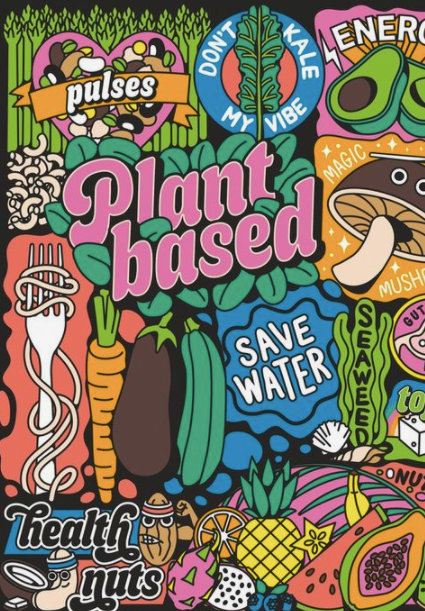
CAMPAIGN POSTER #3:
This is the most eye-catching poster. It is designed to be strikingly fresh and colorful. It is the most simple and impactful design that immediately teaches people that choosing to eat plants prolongs your life. It circles back to the fact that anytime health is mentioned, lengthening your life and quality of life is what the meaning is. I feel the people this message is designed towards will be more interested as to why plant-based diets are healthy and will go to the website to learn more.
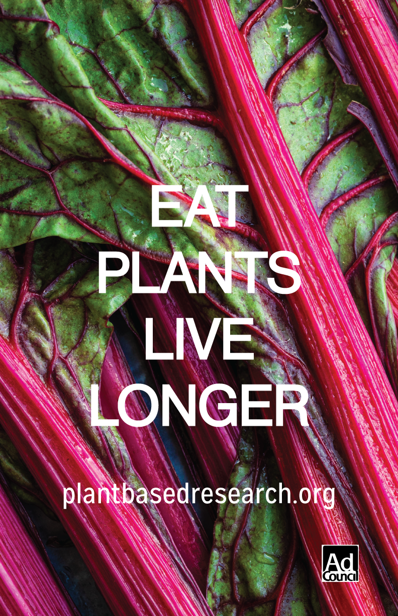
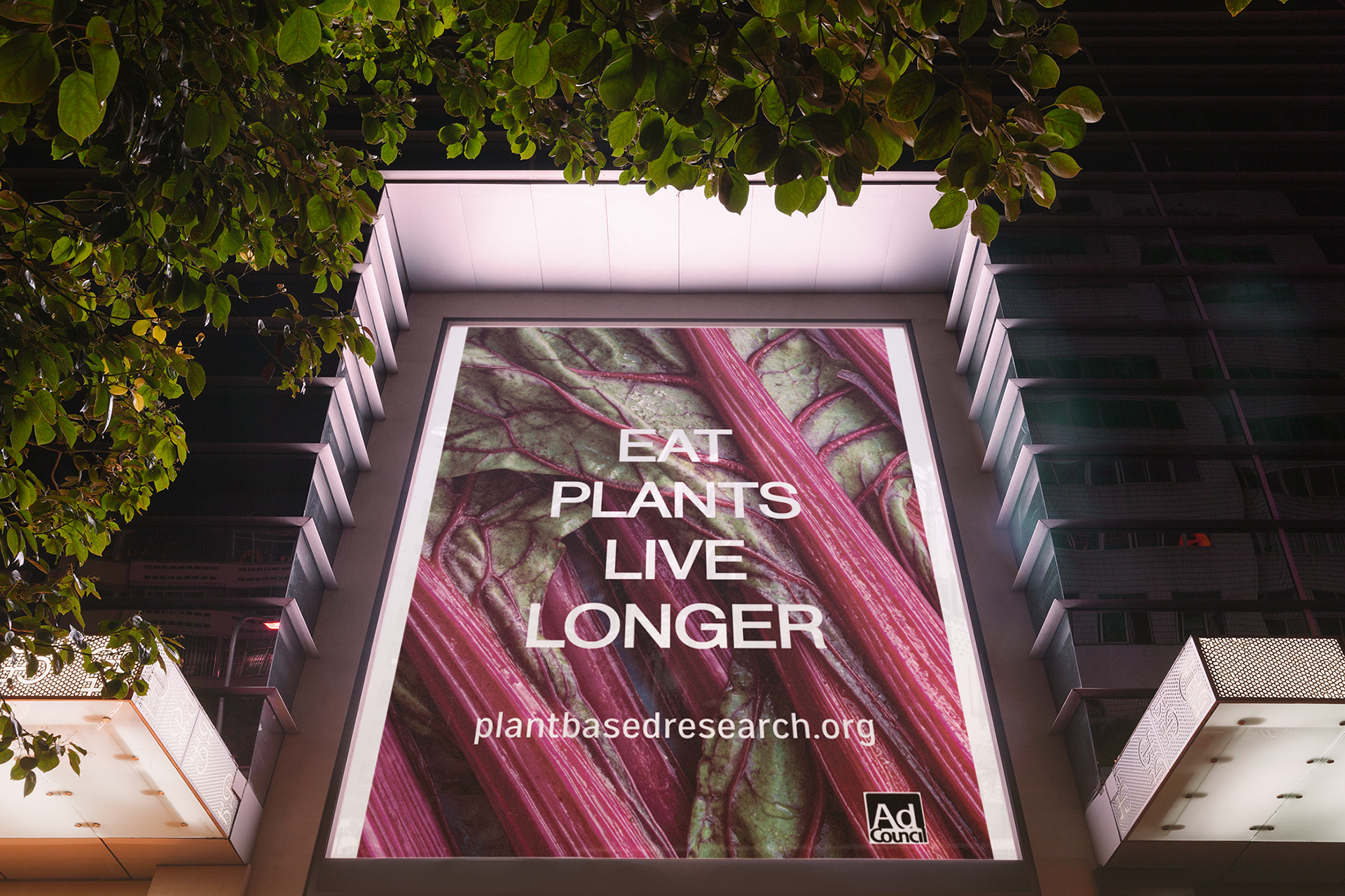
FONTS USED:
Header: Neue Haas Grotesk Display Pro Roman 55
Website: Mission Gothic Regular
COLOR PALETTE: